
A Guide To Typography in Web Design
A Guide To Typography in Web Design
One of the most important goals of a website is clear communication. Great websites organize information well and communicate it clearly, harnessing all the elements of design to get the message across. One central element in this effort is typography. Alongside layout, color, site architecture and content, typography is a make-or-break element of the site’s design. If the typography is not done well, then the website suffers enormously. It’s estimated that around 95% of information on the web is in the form of written text, so with all that text out there, you want to make sure yours is as good as it gets.
In this article we’ll dive into the basics of typography, explaining some of the major points in this field so you can be sure that your content is as easily readable as possible.
What is typography?
Typography refers to how the text on your site is organized, how it looks to the reader. By making appropriate, thoughtful selections in the realms of font, size, spacing, color, contrast, and structure, good typography elevates your website and makes it more communicative, legible, and striking. Here’s a quick roundup of the fundamentals of typography, and how you can use them to truly make your site pop.
-
1) Don’t overwhelm your readers with too many fonts
When you go crazy using several different fonts of various weights, italicization, SIZE, and spacing, it makes it difficult for the reader to know what to focus on, and can look unstructured and unprofessional. In general, it’s a good rule of thumb to stick to one or two fonts on a website. Being consistent with your font selection not only improves the clarity of your site, but helps establish brand recognition and strengthens your message.
If you do combine two “font families”, make sure they complement one another in terms of things like weight (boldness) and spacing. In the following pairings, both using one “serif” font (with “serifs” or wing-like embellishments at the ends of each letter), and one “sans serif” font (without embellishments), notice the difference in their compatibility:
-
2) Use standard fonts
This might seem like surprising advice – if we want our website to be unique and memorable shouldn’t we use unique and rare fonts? It may seem that way, but often when a font is too striking, too distinctive, it can be more of a distraction than anything. Remember, we want the font to draw the reader’s attention to the content, not to the font itself.
As well, popular fonts tend to be what is called “web safe”. These fonts (Arial, Helvetica, Times New Roman, Verdana, Georgia, and Courier are a few) are available on most computers and using them ensures that your page looks as intended on most browsers.
-
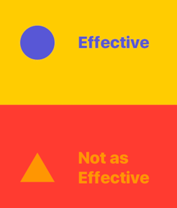
3) Make a hierarchy of information
Break your text into sections organized by topic. In each of these sections, organize your information from broadest at the top, to most specific at the bottom. You should reinforce this flow of information by using large, bold font for your “headers”, smaller font for your “subheaders”, and smallest font for the body of the text. This is called establishing a hierarchy of information, which helps readers easily understand broad categories of information on your site and navigate between them as needed.
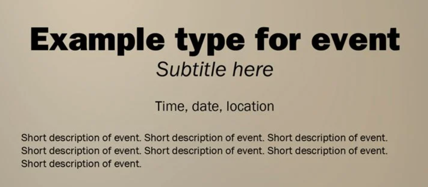
Here, the flow of information from broad to specific is clear.
Remember, when people come to your website, they will not read through every word as they read a novel. They will quickly scan the text, and gravitate towards the headings that draw their attention. A clear hierarchy of information allows people to scan the text and easily understand what is being said and where they should look to get the precise information they require.
-
4) Consider spacing
In the world of web design, more space is generally better than less. Using white space effectively massively improves the readability of your website, by some estimates increasing reader comprehension by 20%. Vertical line spacing is known as “leading” (pronounced “ledding”):
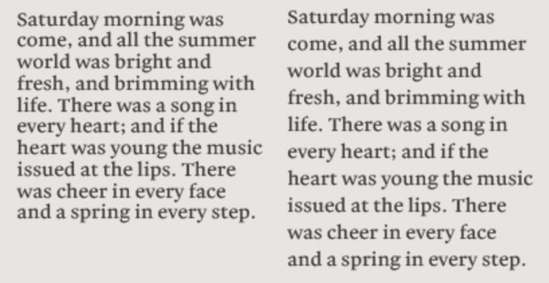
The example on the right is more spacious and easy to follow.
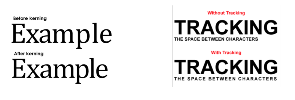
Other spacing concepts, like “kerning” and “tracking”, which concern horizontal spacing between letters and entire lines of text, respectively, help improve a feeling of symmetry, structure and legibility on your website.
-
5) Choose a font that scales well
Ideally, your website is going to be read on a variety of devices – desktops, laptops, iPads, and mobile devices – so it’s important to select a font that is legible at a variety of sizes (this is another reason why working with standard fonts is common practice). When scaling for mobile devices, a safe bet is to set your minimum font size to 16 pixels, which is generally the smallest font most people can read without having to zoom in. As well, in places where the text is the smallest (the body of an article for example), avoid using ornate fonts (like cursive), which can be hard to read at this size.
-
6) Set your line length to between 40 and 80 characters
If lines of text on your site are too short, it means that readers must constantly move from one line to the next, which makes for a disorienting and “jumpy” reading experience. On the other hand, lines of text that are too long can bore or exhaust readers, making them want to leave your site. The sweet spot tends to be between 40 and 80 characters per line. Of course, you may have to make small concessions when considering scaling for mobile, but this is a good rule of thumb.
-
6) Design with color in mind
Make sure the color of your text is clearly visible against the color of your background. If the colors are too similar, or are not easily distinguishable for those with color blindness (red and green are a bad pairing for this reason), your text will be difficult to distinguish. Also, make sure you have an appropriate contrast ratio of 4.5 to 1 for smaller text, and 3 to 1 for larger. For more on this and similar concerns, see our recent blog post about web accessibility.
High-contrast color combinations make your text stand out.
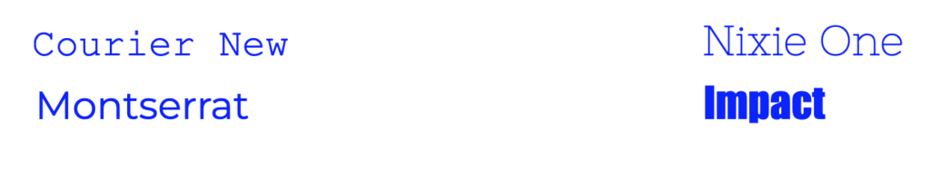
See how the two fonts on the left nicely complement one another, whereas on the right, the “Impact” font overwhelms “Nixie One” with its weight and dense spacing.
Put your designs to the test
With these handy tips, you’re ready to get cracking with typography that brings your website to the next level. But at the end of the day, nothing is as important as what your users think. That’s why it’s important to test, test, test: don’t be shy to ask for feedback from as large a group of users as you can for anything that feels counterintuitive or difficult to understand. After all, clear communication is the name of the game. If you test, listen to feedback, and make adjustments as you go, you’ll be well on your way to having a website that’s as clear and concise as it is striking and bold.
Get in touch to discuss a web project with us. We’re always ready to get started on a striking website with a clear and compelling message.