Web Accessibility is the idea that each and every person should be able to use the internet and that every website be designed to accommodate various user requirements. These accommodations pertain to disabilities in the areas of vision, hearing, cognition and motor skills, and also accommodate for device limitations.
As exploring the web becomes more and more central to the everyday lives of people all over the world, used for everything from tax information, to news, to grocery shopping, it’s increasingly important that we as web developers are designing and developing sites that are accessible for all. As of 2022, it’s estimated that around 10% of the world’s population – 650 million people – currently live with a disability. Making your site accessible for this large population is not only the right thing to do–it is good for your traffic as well. Studies have shown that accessible websites have better SEO, and tend to reach a bigger audience.
Here are a few simple design strategies that will help your site meet W3C’s internationally-recognized set of Web Content Accessibility Guidelines.
Consider Contrast & Color
Contrast is a very important aspect of good accessible design. People with low vision can find it hard to read text on your site if the contrast is low, so make sure that the contrast ratio between your text and the background is at least 4.5 to 1 for smaller fonts, and 3 to 1 for larger. You can verify if your ratios are up to standard by using tools like Web AIM’s color contrast checker.
compare these two examples of image contrast
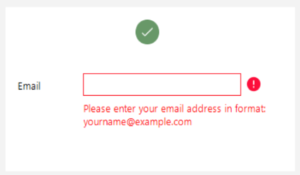
Color is an often overlooked element of web design, considering an estimated 7 – 8% of people worldwide are colorblind. Critical information on your site (say for example, error messages in vacant fields) should be indicated by other means than just by color. Consider marking this information with the use of icons, text boldness or underlining, in addition to color.
Here, the error message is relayed by the presence of a “!” icon in addition to the red outline.
If you were to print out the image above in black and white, notice that you would still be able to understand the error messages without color. This is a good accessibility check to run on your pages when considering color accessibility.
Make your Site Keyboard-Friendly
Your site should be fully navigable by the use of the keyboard alone. For various reasons, many people are unable to use a mouse, and as such rely on keyboard-only assistive technologies. On most computers, hitting the “Tab” key will navigate between links, forms and buttons using an outline (typically a blue box) called the focus indicator. You can design the focus indicator to suit the aesthetic style of your website, but make sure it is clearly distinguished from the links that are not being selected, with (say it with me now:) good contrast!
Hit the “Tab” key on your site several times: can you navigate all of the links on the page? Including drop-down menus? Non-modal dialogs? If not, you may want to improve your website’s keyboard accessibility, a handy guide to which is right here.
Left: an example of a “focus indicator” box..
While we’re on the subject, a quick word about mouse hovering: if there are links that only become actionable when hovered over, your site is less accessible for people using keyboard navigation, as well as people interacting with your site via speech recognition technology. Instead of hiding your actionable items behind hover states, consider adding numeric hyperlinks (this way, users can speak numbers which correspond to different links), and making all your actionable links ever-present.
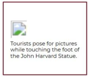
Add “Alternative Text” to your Images
Many people who are vision-impaired rely on screen readers to hear the text on your website, rather than read it. For this reason, it’s important to provide your images or other non-text information on your site with alternative text. You can do this either with the use of “alt attributes” (or “alt tags”), or with text surrounding the image itself.
Aside from the issue of accessibility, a benefit of using “alt attributes” is that if the image fails to load, your reader will see a description of the image rather than the image filename, a truly horrendous sight. As well, alt attributes or surrounding text can help juice your SEO, providing keywords for search engines to crawl.
This is alternative text
Consider your Markup
Proper HTML tagging communicates to your browser the hierarchy and flow of information on your page, and likewise, screen readers use this tagging information to navigate your page. Make sure to use heading structure properly (rather than indicating hierarchy of information purely through differing font sizes). This way, people using screen readers can easily listen to a list of all the headings and navigate towards more specific content from there in an intelligible, hierarchical manner. Consider using ARIA landmarks to help make navigation more concise for those on screen readers.
Make Accessibility Fundamental to your Design Process
There are some who consider the practise of accessibility in web design to be some kind of “added extra”, or something that will increase expense and decrease aesthetic appeal. This is only true if you design an entire site without accessibility in mind, which will then require an extensive and costly redesign. Not to mention in many countries web accessibility is the law, for example in Title III of the Americans With Disabilities Act (ADA), which prohibits discrimination “on the basis of disability in the activities of public accommodations”. This law was initially designed to regulate access to physical locations, but increasingly applies to the web as well. Accessibility is therefore fundamental to the web design process, so you would be smart to have it top-of-mind from day one.
Functional Web Design for All
We hope this has been a helpful overview of some of the basics of designing for an accessible website. If you’re looking for a more comprehensive list, W3C’s WCAG at a glance is a good resource. The world of accessibility guidelines is vast and ever-changing, and we should all be doing our best to make a world of thoughtful design so the needs of our users, teams and executives – especially those with disabilities – can be met.
Have questions about accessibility and your website? Get in touch with Millennial Web Development – we’re happy to answer any questions and find a way to make your website accessible to everyone.