Designing Simplicity In A Complex Field: Case Study for LabKey
Designing Simplicity In A Complex Field: Case Study for LabKey
You have 8 seconds to convince me…
We all spend a lot of time online, and much of that time is spent scrolling, skipping from tab to tab, following links for a few moments and then following another one. We rarely spend much time on any given website or app. Instead, we continue jumping and moving. Our online attention spans are short – experts say as short as eight seconds on average. So then, how do we communicate complex ideas and show visitors the true capacity of our products and services? This is where good design steps in.
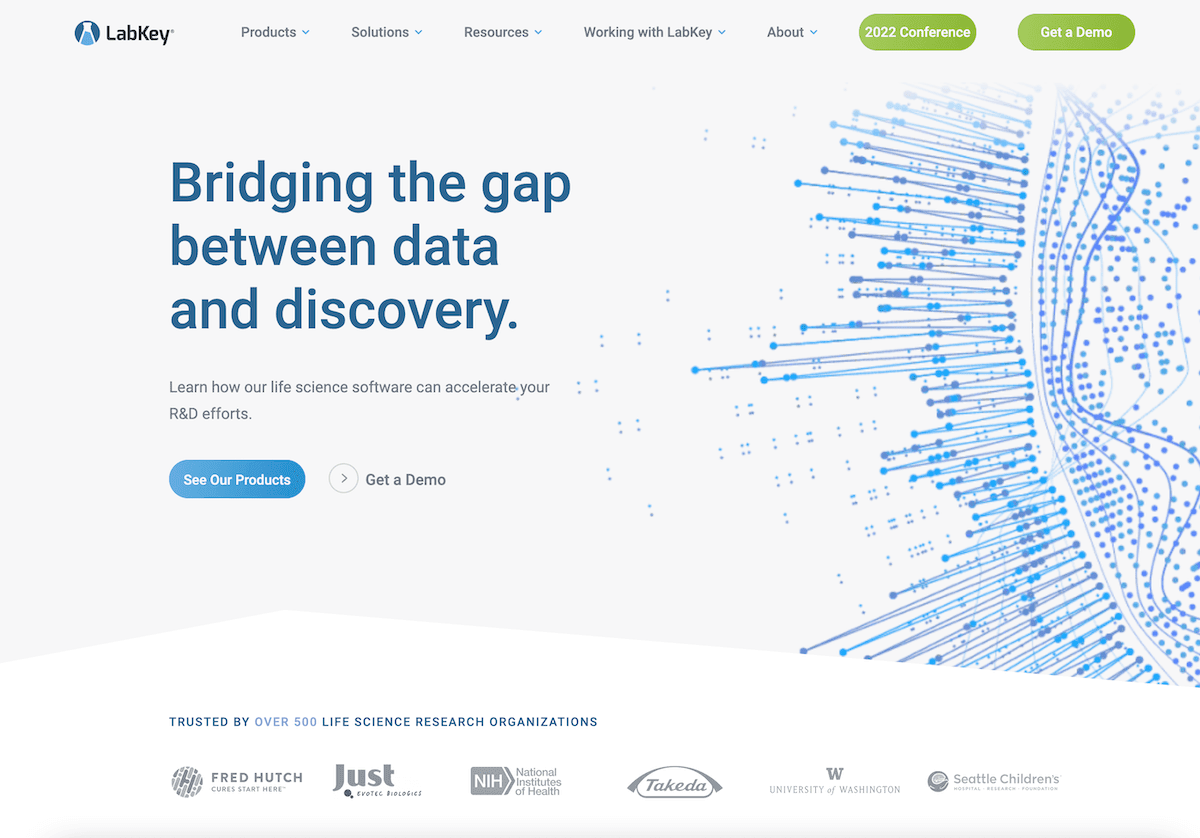
Our recent project for LabKey presented us with this challenge. LabKey is a company that produces leading software for life sciences labs. What they do is pretty niche and quite complex. We needed to communicate the breadth and complexity of LabKey’s software offerings, without getting too dense, and without losing the attention of our visitors. We think the result is pretty great and we’re excited to share the process with you.
Content Avalanche
When we came on the project with LabKey what we found was a website that worked well, but suffered from many of the design problems that you’d associate with a niche, highly technical, science-based software company: too much information, presented in clunky and uninteresting ways, essentially in large blocks of text.
While this had served them in their rise to prominence in their field, the web had moved away from this kind of design (for good reason) and we knew that their new site would have to present the complexity of their product in simple, easy to grasp, and visually compelling ways.
White Space
Making a website feel spacious and digestible often comes through bringing white space into the design. By white space, we mean space that is not taken with images or text (it doesn’t necessarily need to be white). Our approach to the home page design and to the design schemes throughout the site was to bring spaciousness to the page, so that it doesn’t overwhelm the eye with clutter. Just like walking into a store, empty spaces helps make it feel that what is in the space is more important and elegant. It also relaxes the eye and makes it easier to read the text.
Variations with Modules
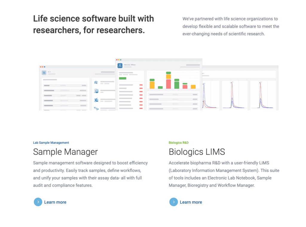
Because there was a lot of content that we did need to get on the page, we knew that we needed to create content modules that provide variation as well as spaciousness. Variation is the key to holding attention. By presenting sections of text and images in different layouts and with different visual elements, the visitor has a renewed sense of interest as they move through the site. This is crucial to increasing engagement and conversions.
Organization and Architecture
Another important aspect of a large site like this is organizing it in an intuitive and clear way. We knew that we needed visitors to be able to easily find the specific information that applies to their interests or answers their question. We went through a process of re-organizing the content that does exist, organizing it into clear menus and linking structures, and creating multiple paths through the website for different visitors. With a more organized and intuitive site architecture, we were able to bring some content that was buried in tertiary subpages to the front, giving better access to information that visitors were looking for.
Keep It Fast
Finally, speed was a big issue with this site. That eight seconds we mentioned above includes the time it takes for the page to load. In fact, Google reports that load speeds longer than 3 seconds result in a significant drop in engagement metrics. No matter how great your design is, if it’s not lightning fast then you will lose important visitors. Throughout the process of designing LabKey’s new site, we kept speed as a major priority and it paid off: LabKey’s Pagespeed score is in the very high 90s (some pages score at 100) and the site is consistently loading in less than 2 seconds.
It Pays Off
After working for over four months to plan, design, develop, adjust, test and finally launch the new site, we are all quite proud of the result. Here’s what Will, the director of the project from LabKey, had to say:
“So far we have received lots of positive feedback on the site internally and from prospects we have spoken to. The overall clean and modern feel is on-target for our audience and products. The site is super-fast and we can see the difference when analyzed with various tools as well as in our own interactions with the site. We are also seeing positive increases in our search positioning, user traffic and page views.”
Thanks Will! We loved working with you and really look forward to seeing LabKey’s continued success online.
Do you have a project that needs a great design and development team to take it to the next level? Get in touch, we would be happy to discuss it.